RETHINKING UX IN A WEB3 ERA
28.07.2023
Gleb Specter
10 min

RELATED
SUBSCRIBE TO OUR BLOG
The Promise of Web3 and its UX Complexity
Challenge 1: Explaining the Obvious in Web3 Design
Emphasizing Transparency in UX Design
Challenge 3: Balancing Creativity and Functionality
Share this article:
Web 3 UX principles
Challenge 2: Instilling Product Trust with Web3 UX Design
Not only intuitive UX design but also a highly comprehensive one
The increasing adoption of blockchain technology promises to revolutionize the internet, ushering in the era of Web3. As decentralized technologies gain traction, they present a multitude of new possibilities for fintech platforms and digital products.
The core idea behind Web3 is a decentralized economy. While the user experience may resemble that of conventional fintech products, the UX design in Web3 and blockchain is far from simple, given the innate characteristics and complex jargon of this technology.
Consequently, understanding the challenges of UX/UI design in Web3 has become crucial for business owners and product designers aiming to remain competitive in this new digital age.
Many users find it daunting to interact with dApps, despite the elegant and functional principles of Web3. To ensure smooth and comprehensive interactions for users without a technical background, meticulous attention is required.
The overcomplexity of blockchain terminology, including terms like "swap," "gas," "consensus mechanism," "private key," etc., can confuse new users. Thus, explaining concepts that may seem obvious to us and developers, becomes a critical challenge in Web3 design. In contrast, conventional fintech products require less explanation for basic tasks like depositing funds for trading.
In DeFi products, designers must create predictable user journeys, such as guiding users to make deposits. When trading on DEX or a DeFi protocol, gas fees may constantly fluctuate depending on the network, making it essential to inform users about these changes and their reasons.
Transparency is crucial in Web3 products to increase trust among users. Clearly illustrating how blockchain immutability works, even in simple UX cases, is essential. Building a clear algorithm for users on the concept of immutability helps them navigate the product smoothly.
Tactile features on mobile devices and urgent security warnings on desktops can enhance the user experience and increase trust.
Tactile features on mobile devices and urgent security warnings on desktops can enhance the user experience and increase trust.
It is a standard for most Web3 products to impress users with a creative design and fascinating animations or website flow. The aspect of the decentralization of the industry gives products the flexibility and freedom to unveil their creativity and build a whole brand identity based around a sushi emoji, for example.
Now that we know the 3 main challenges facing UX in Web3, and the possible solutions to them. Let's take a look at the principles to follow when making a seamless user experience for your followers.
In Web3, a lack of clear explanations combined with the inability to facilitate transactional rollbacks or disputes through customer support can erode trust in a product. Due to the nature of blockchain, all transactions are immutable, permanently recorded on a public ledger.
When it comes to the Web3 design, it takes an additional toll for designers to convey this into the UX/UI.
Web3 design requires a display of additional security warnings for users that help prevent them from losing their assets by an accident, or even worse by a poor interface. It’s always good to think three steps ahead of users in Web3 design to increase product trust. When a user’s expectations match the transactional outcome it’s a win.
A highly comprehensive Web3 design will mean an effortless user experience for newcomers. It is important to tackle the complexity of Web3 jargon for mundane features, that users will be using daily, such as swapping (trading or exchanging one token for another), transferring assets on-chain, etc. Using simple and clear messaging and communications is thus essential, especially during any transaction stages where users might face the risk of permanently losing their money.


For example, when transferring assets to another wallet, it is important to check the wallet address without confusing it with its private key. The trick is that the private key must not be exposed anywhere, otherwise, the wallet can be considered compromised.
People want to “see the blockchain” even when they don’t need to.
For example, why a user should conduct transfers only through the “right” network (for example — Ethereum) for his ETH when moving assets to a different wallet? Otherwise, it will cause a permanent loss of funds.
As Web3 continues shaping the future of the internet, confronting UX challenges is crucial. By enhancing user experience through transparency, trust, and creativity, you can usher in a new era of decentralized innovation and foster meaningful connections with your audience.
Web3 is rapidly evolving, and numerous startups are eager to embrace its potential. However, amidst this excitement, there are several challenges that we must confront and overcome.
In this guide, we will explore the most pressing difficulties faced by UX in the world of Web3, propose solutions to tackle them, and discuss the key principles you should follow to create an exceptional user experience for your followers. Let's delve into it!
In this guide, we will explore the most pressing difficulties faced by UX in the world of Web3, propose solutions to tackle them, and discuss the key principles you should follow to create an exceptional user experience for your followers. Let's delve into it!

Building a highly informative design is key, but it must strike a balance to avoid overwhelming new users with excessive information. Offering a lightweight version of the product for less experienced users can be a good solution in such cases.
- One of the ways to tackle this is to deliver the most user-friendly prompts in the shape of pop-ups or warning on-screen notifications;
- Another way is to invest in user-friendly guidelines and documentation. For successful Web3 product, these are very much a must.
To make the guidelines and documentation easy to understand, provide a summary of each section, linking them to all relevant technical parts. Offer users access to interactive glossaries that will enable the easy check of the Web3 definitions, slang and jargon. To make guidelines even more comprehensive and engaging designers can mix in infographics and animations that illustrate Web3 concepts.


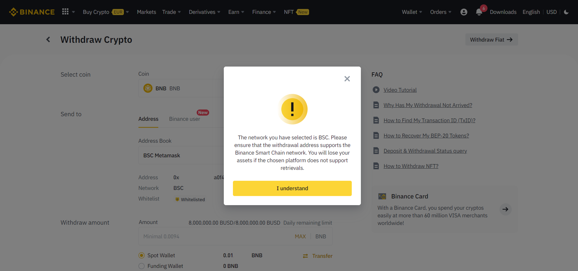
An example of good UX on Binance exchange – is the pop-up shoes a crucial reminder about choosing the right chain to withdraw crypto from a custodial Binance wallet to an external one.
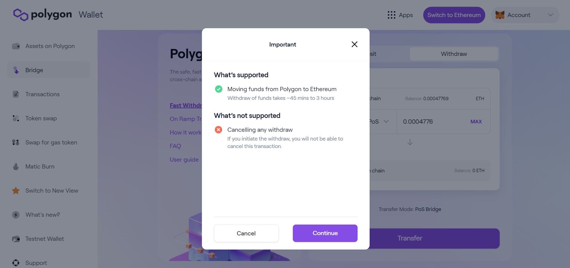
A good example of comprehensive UX on Polygon bridge warns users before they confirm a transaction on-chain.
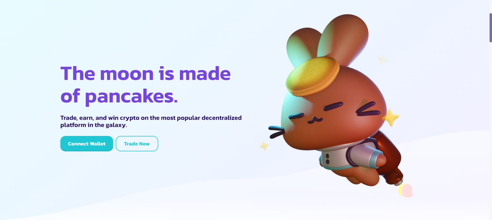
Example of Pancake.finance landing page. — the DEX and DeFi product, their brand mascot is a pancake rocket bunny.
Furthermore, there should be a seamless display of all the events on a network that may affect the user experience. Transaction delays, estimated processing times, or even the simplest things like wallet balance reflection should be openly communicated and connected with the events on a network in real-time.
For Web3 products it’s crucial to stand out. Because it should be exciting and memorable for users, while creating a strong connection with a specific crypto target audience. On the other hand, many different products in Web3 are trying to compete with their extraordinary brand identity. By doing so, many Web3 product owners can lose the sharp image of their audience, and hence lose the valuable connection with the potential users.
1. Design for trust through transparency
2. Time/Wait Management:
3. Consistency
4. Constant feedback
6. Interactive learning and guidance
5. Data exposure
Clarify important information, such as contact addresses, blockchain usage, irreversible actions, and actions involving money or value. Display transaction data in a human-readable format and offer access to program codebases and relevant technical parts.
Address the decentralized nature of blockchains and manage users' wait time during network congestion. Clarify the relationship between gas fees and waiting time, provide progress indicators, and offer potential solutions when transactions take longer to process.
Reinforce trust by maintaining a consistent visual design language throughout the product. Use purposeful UI elements and present information in line with users' natural communication patterns.
Provide context-based feedback at every stage of user actions, guiding them through the process. Use tooltips and interactive onboarding to educate users and anticipate potential mistakes.
Actively educate users, offer guidance, and create a user-friendly environment, especially for new users. Anticipate mistakes and provide a newbie mode that simplifies complex features and information.
Leverage transparency to increase users' understanding of the system. Present actionable data that builds trust and educates users about the decentralized nature of Web3.
- Clarify contact address(es);
- Clarify the blockchain in use (data source), plug-in external blockchain explorers;
- Clarify irreversible actions;
- Clarify actions that involve money or value;
- Clarify actions that could potentially expose user identity;
- Show transaction data in a human-readable format in line with smart contract requirements;
- Clarify gas fee price range and how to adjust spillage;
- Manage transaction wait time, provide waiting duration;
- Provide access to the program’s codebase, specify TestNet.) programs from MainNet.);
- Clarify blockchain network in use and how to change it;
- Clarify transaction details; gas fee, time stamps, address, blockchain, etc;
- Clarify which data is from oracles and which is not;
- Provide transaction history with an address. Allow users to search, delete, export or share;
- Clarify irreversible actions, add friction to slow users down;
- Clarify when actions cost money or value.
- Clarify the relationship between gas fees and waiting time;
- Show progress or waiting icon until the transaction is approved or denied;
- Provide feedback on potential causes and/or solutions when a transaction takes more running time to process.
Example: “If transaction X take takes more than 10 mins” Consider the following options:
- Ask users to wait longer.
- Increase gas fee to speed up processing. (with user’s permission).
- Notify user of transaction status; Successful or declined. Either way provides transaction details. Eg: Transaction Hash.
- Consistent visual design language throughout the product;
- Leverage design/UI elements purposefully to clarify concepts;
- Use less technical jargon;
- Present information that aligns with users natural communication patterns;
- Maintain a conversational tone, words should be meaning-loaded.
- Context-based feedback: The user should always know what is happening, what just happened, and what will happen next;
- Clarify the steps left in the process;
- User motion and animation sparingly;
- Use interactive onboarding to show users possible actions;
- Use tooltips when necessary to provide more detail on a particular action;
- Use wavelike load bar during wait time to induce perceptive speed.
- Clarify possible action in an interface, especially to new users,
- Provide active guidance to users,
- Clarify how to revert to the previous state/environment,
- Provide a newbie mode that obscures complex features and information,
- Allow and anticipate mistakes.
- The data must be actionable.
- Use data to build trust and educate users.
- Use human Readable Hashes formats:
- Show abridged versions of transaction hashes — always show the initial and end parts. ie: 0xABCD…EFGH
- Use 0x to show it's a hash.
- Allow users to see the full address/hash.
It’s important to capture the last 4 characters rather than just the initial. Revealing only initial values pose security issues because the first 4 characters can be easily generated using Vanitygen, but the last 4 are ungodly difficult to fake.
To build trust:
To manage time:
Ensure the following:
Provide the following:
Ensure the following for data exposure:
How much does it cost to cooperate with a crypto marketing agency?
The cost of using a crypto digital marketing company will vary depending on the size and scope of your campaign. However, we believe that our prices are very competitive and offer excellent value for money. If you would like a more accurate quote, please contact us and we will be happy to provide you with a customized proposal to fit your budget.
What are the best marketing channels for my crypto offering?
The best advertising and marketing channels are the ones that will allow you to reach your target audience most effectively within your budget. This will vary depending on your type of cryptocurrency project - whether it’s an ICO or a more well-established offering. However, some of the most popular marketing channels for crypto projects include the following:
- SEO & Content Marketing
- PPC Ads
- Social Ads
- PR & Outreach
- Influencer Marketing
- Online Communities
- Press releases
From what and how exactly we can start a collaboration?
Sure thing, we start with a briefing and underlining your goals, to make it our main focus in the work progress, then we’ll give you a couple of gifts (secret), connect your personal marketing manager to your project and launch campaigns. Just beep us on telegram @cryptorsy_io_bot , email us at hello@cryptorsy.io, leave your request here or book a call on our website. We have a principal position: what starts perfectly, will go on perfectly. So be sure, the process of work will be perfect in detail.
How I can be sure that you’ll deliver results?
As a team of data-driven crypto digital marketers, we place a strong emphasis on ROI. We believe that transparency is key — that's the reason we’ll always keep you up to date with our progress, so you can check out the results at any time.
Our combination of experience, expertise, and flexibility makes us some of the best crypto marketing experts in the industry. Here are some of the ways we ensure our clients get the best results:
Our combination of experience, expertise, and flexibility makes us some of the best crypto marketing experts in the industry. Here are some of the ways we ensure our clients get the best results:
- We have a team of experts who are solely focused on marketing cryptocurrency.
- We stay up to date with the latest industry news and trends.
- We develop creative solutions that are designed to help our clients overcome the unique challenges present in the world of cryptocurrency.
- We are always monitoring our campaigns to ensure they are delivering the desired results.
- We always remain agile and adapt our cryptocurrency strategies as needed.
- We offer competitive pricing to fit your budget without sacrificing quality.
What makes Cryptorsy unique and super valuable to me?
All our benefits: gifts, personal marketing manager, free audit, all services on a high-quality level, super easy-to-take prices, perfect scenario and funnels for result getting, and our powerful web3 network, that we can connect to you (all our relations and guys, that can strengthen your performance).
What do I get if I accept your offer, and what do I lose if I refuse?
Shortly, you’ll lose your dedicated crypto marketing partners that could bring you the highest results in the space because they’ve done this a million times, and why don't we do that with you?
What do you get? You get a successful marketing launch and sustainability in your future because 21+ TOP-level experts will manage your marketing activities!
What do you get? You get a successful marketing launch and sustainability in your future because 21+ TOP-level experts will manage your marketing activities!
Want to hack the stunning growth formula for your project? Our team has prepared something extremely special for you, just leave your application to get yours!
SCHEDULE YOR FREE CONSULTATION NOW


